
Improving Angular Component’s accessibility
If you’ve looked at the Angular roadmap recently, you’d see that one of the major focuses of the Components team this year is accessibility. The outcome is better, more accessible components.
This work will all come with no change required for application developers, ng update will deliver more accessible Angular Material experiences out of the box.
Along with code changes to the components, we’ve revised and expanded documentation with revised Accessibility sections in each of the material.angular.io component’s overviews and examples. You can view these by selecting any individual component and scrolling to the Accessibility sub-header.
We keep saying the components are more accessible, but how exactly?
My goal in this blog post is to highlight how each component has been improved. If you’re using a standard like WCAG to guide your accessibility practices, this post will outline some of the improvements included just by running
ng update.
Improving today’s components and the MDC-Web based components
The migration to integrating MDC Web is currently in progress on the Angular roadmap, and incorporates reusable primitives for building Material Design components to align more closely with the Material Design specification. This upgrade to a newer spec includes a range of built in a11y improvements. Our accessibility review also targeted improving these components as they will be the default moving forward.
You can try out the MDC Web based components in your projects by installing with npm i @angular/material-experimental, then pointing imports of existing components to the experimental updated versions like this:
// Before
import { MatCheckboxModule } from ‘@angular/material/checkbox’;// After
import { MatCheckboxModule } from ‘@angular/material-experimental/mdc-checkbox’;
In an upcoming version, these components will become the default Angular Material components, so all of the following improvements will be built into the mdc-based migration of components. Keep in mind that some of the improvements highlighted below will not land in the default Angular components until this migration is complete.
Component improvements
cdk/a11y
The a11y package provides a number of tools to improve accessibility, like FocusTrap and LiveAnnouncer. These tools are used in multiple components to add accessibility functionality.
FocusMonitor now correctly detects fake mousedown events from screen readers.
This helps ensure that when focus and click events happen on the screen, they are correctly interpreted by your applications.
This also includes more granular detection of input modality such as keyboard, mouse and touch events.
Badge
Better ARIA descriptions
The badge’s description is now applied to the badge’s host element via aria-describedby. The component previously applied an aria-label, which was not the best way to communicate the augmentative nature of the badge.
<button mat-stroked-button matBadge="7" matBadgeDescription="7 unread messages">
  Inbox
</button>
Bottom Sheet
Add autoFocus options for initial focus when a bottom sheet is opened
When opened, MatBottomSheet traps browser focus. By default, the first tabbable element in the bottom sheet receives focus. You can now customize which element receives focus with the autoFocus property of MatBottomSheetConfig.
openBottomSheet() {
  const bottomSheetConfig = new MatBottomSheetConfig();
  bottomSheetConfig.autoFocus = '.custom-tab-header'  return this.bottomSheet.open(this.template, config);
}
Button
High contrast outline for solitary icon-buttons
Icon buttons now have correct styling in high contrast mode when on pages that contain no other buttons.
Touch target sizes
The buttons, and several other components, now utilize MDC-Web’s specs for larger touch target sizes. This means there is more area in a button to successfully navigate and click.
Checkbox
Screen readers no longer read svg images within the checkbox during selection.
Expands the touch target size for checkbox selection. (MDC only)
Chips
Guidance on matChipRemove
matChipRemove is a directive which provides styling and behavior for removing chips from a list.
In the past, this directive appeared in documentation applied to <mat-icon>, which provides limited accessibility when clicked. New documentation and styling defines the best practice to apply matChipRemove to a <button> with a nested <mat-icon>, so that the button click is more accessible for users, with the same visual appearance.
<button matChipRemove *ngIf="removable">
  <mat-icon>cancel</mat-icon>
</button>
Datepicker
There’s a bunch here because accessible date-pickers are, well, picky.
Changes include:
- Fixes that the color contrast of the calendar header’s text was too low.
- The grid in
mat-datepickernow follows the structure expected for the grid role andVoiceOvercan correctly read column headers. - The role is now read by the
aria-labelledby, form fieldlabelor defaults to “dialog”. - Screen readers now read out the correct day of the week for dates in the first row.
- Fixes reopening of the picker when a date is selected using the spacebar on Firefox.
- Date ranges and calendar arrow support in high contrast mode.
The team is continuing to invest in additional Datepicker improvements in Q4 that will land in future versions of Angular.
Dialog
Add autoFocus options for initial focus when a dialog is opened
Previously, autoFocus was a boolean that allowed users to specify whether the container element or the first tabbable element is focused on dialog open. Now you can also specify focusing the first header element or use a CSS selector and focus the first element that matches that. If these elements can’t be focused, then the container element is focused by default.
openDialog() {
  const dialogConfig = new MatDialogConfig();
  dialogConfig.autoFocus = '.custom-dialog-tab'  this.matDialog.open(DialogBodyComponent, dialogConfig);
}
Better screen reader experience when opening a dialog
Screen readers now read the dialog title, role, content, and then inform the user about the focused element after being opened, following W3 best practices.
The dialog also avoids opening multiple of the same dialog before animations complete. In previous versions we moved the focus twice on dialog launch, sometimes confusing screen readers and missing the announcement that a dialog was opened. We now only move focus once, and block the user from opening repeats of the same dialog while one is animating open.
Expansion Panel
Add a bottom border to headers in high-contrast code.
Form field
Adds missing focus indicator for outline appearance in high-contrast mode.
Input
Show focus indication for readonly inputs
A long time ago we disabled focus indication on readonly inputs in order to mimic the native browser behavior, this reverses these changes to match best practices.
Updates how screen readers announce inputs in invalid states
Allows aria-invalid on matInput if the input is required and has no value so that screen readers can inform users of the input’s invalid state.
List
action-list focus state for high contrast mode in Firefox
Set initial focus on first selected option in selection list
Initial focus is set on the first selected option and falls back to the first option, so a user experiencing a selection for the first time is more informed of their options.
Menu
Adds submenu icon support in high contrast mode
We originally rendered this little triangle with a clever CSS trick. It turned out this was too clever and didn’t render correctly in high contrast mode. It’s just an SVG now.
Paginator
Add screen reader announcement for current range when navigating between pages
The paginator will now read and announce navigation and page ranges.
Adds aria-labelledby support
Also adds role=”group” to the Paginator element
Progress bar and Progress spinner
Make progress indicators reachable by screen readers
This sets the tab index to -1 so screen readers will read the aria-label.
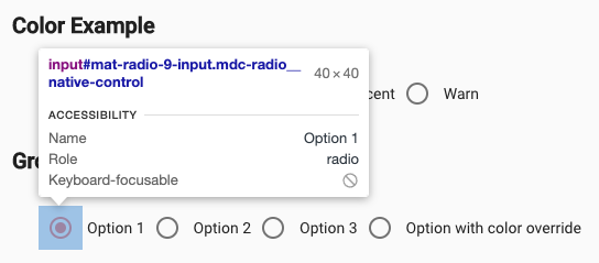
Radio button
Adds accessible touch targets on the radio button.
Select
Better visuals in high contrast mode
This removes the small rectangle rendered over the select placeholder text and makes the dropdown arrow visible.
Sidenav
Similar to Dialog, autoFocus now has expanded options for initial focus.
When opened, Sidenav can trap browser focus. By default, the first tabbable element in the bottom sheet receives focus. You can customize which element receives focus with the autoFocus property to ’dialog’ | ‘first-tabbable’ | ‘first-heading’ or a CSS custom selector.
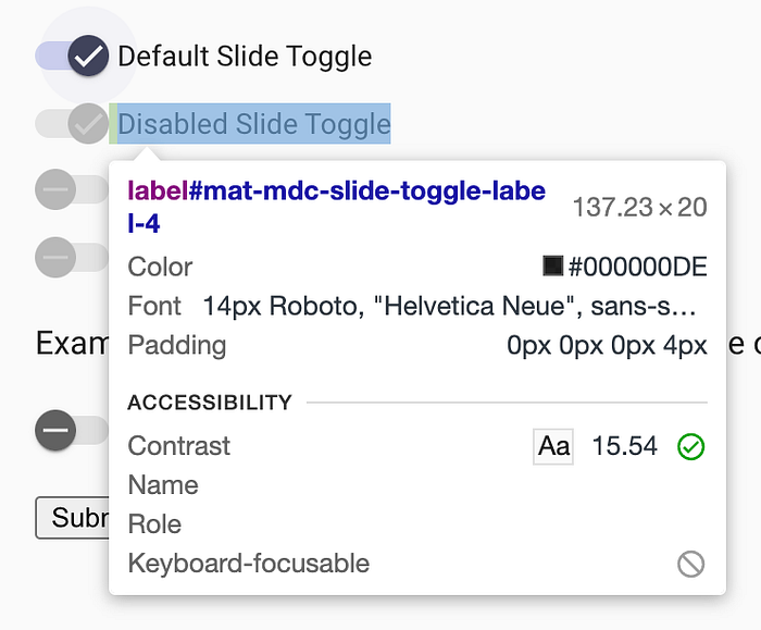
Slide toggle
Increase the contrast of disabled slide toggles in high contrast mode.
Slider
Adds a strong focus indicator
Sort header
Add description input for sort-header
Adds a description input for mat-sort-header so that developers can provide an accessible description (using AriaDescirber under the hood). Additionally update the accessibility section for the sort header’s documentation with guidance on providing an accessible experience.
<table mat-table [dataSource]="dataSource" matSort (matSortChange)="announceSortChange($event)"
class="mat-elevation-z8">

  <! - Position Column →
  <ng-container matColumnDef="position">
    <th mat-header-cell *matHeaderCellDef mat-sort-header sortActionDescription="Sort by number">
      No.
    </th>
    <td mat-cell *matCellDef="let element"> {{element.position}} </td>
  </ng-container>

  <! - Name Column →
  <ng-container matColumnDef="name">
    <th mat-header-cell *matHeaderCellDef mat-sort-header sortActionDescription="Sort by name">
      Name
    </th>
    <td mat-cell *matCellDef="let element"> {{element.name}} </td>
  </ng-container>  <! - Weight Column →
  <ng-container matColumnDef="weight">
    <th mat-header-cell *matHeaderCellDef mat-sort-header sortActionDescription="Sort by weight">
      Weight
    </th>
    <td mat-cell *matCellDef="let element"> {{element.weight}} </td>
  </ng-container>  <! - Symbol Column →
  <ng-container matColumnDef="symbol">
    <th mat-header-cell *matHeaderCellDef mat-sort-header sortActionDescription="Sort by symbol">
      Symbol
    </th>
    <td mat-cell *matCellDef="let element"> {{element.symbol}} </td>
  </ng-container>
</table>
Stepper
The stepper received a number of updates including:
- Add styling for high contrast mode
- Add text for screen readers to indicate when step is complete
- Remove ripple and hover styling for disabled step
- Indicate to assistive technology when step is disabled
- Better strong focus indicator
Table
Adds default role to ‘table’
Adds role=”table” to the html element. When we originally built the table, we assumed that most MatTable instances would be rich, interactive tables, so we applied role=”grid”. But after seeing how developers use MatTable, we determined that role=”table” is actually more appropriate for the most common cases.
You can still set role=”grid” on the <table> element and all of the appropriate descendent roles will apply (e.g. gridcell), but MatTable doesn’t currently provide any of the expected keyboard interaction for role=”grid”.
Tabs
Increase functionality when using both tabbing and keyboard events
We now keep the ListKeyManager state up-to-date on tab navigation so that tabs can be fully interact-able with both Tab and keyboard events.
Tooltip
Increase color contrast on the tooltip
This makes the background color opaque to increase the contrast and make the tooltip more readable.
Thank you for continuing to develop with accessibility in mind!
If you notice an additional a11y improvement we can make to components, please open an issue on the angular/components GitHub.
